Typeface
Typeface Analysis
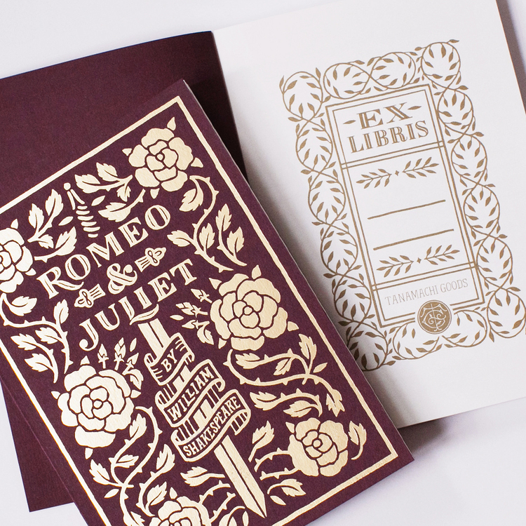
This unnamed typeface by Dana Tamachi is used on the book cover of William Shakespeare's Romeo & Juliet. It can be classified as a transitional serif typeface which imitates the style of old handwritten manuscripts. The serifs of the type are rounded which make a transition from the strokes to its serifs smooth and it has a strong vertical stress most apparent on the ‘O’. On a majority of the letters the strokes are an even, thick weight that make them pop out to the eye, however on the ‘O’, ‘M’, and ‘U’ specifically there are some thinner strokes which suggests it could be a blend of different typeface classifications like transitional and humanist. (Dana Tamachi, Tanamachi studio)
The finials end with a large circle pointing inwards towards the rest of the letter, giving it a friendly and inviting quality. The end of the ‘L’ and one of the ends of the ‘R’ extend below the baseline and curve back up to a rounded point which make the stroke feel reminiscent of the stroke of a brush additionally seen with the small empty space in the middle of the strokes. The handwritten and old feel of the type was an intentional decision made by Tamachi because of the book being a classical play from Shakespeare.
The finials end with a large circle pointing inwards towards the rest of the letter, giving it a friendly and inviting quality. The end of the ‘L’ and one of the ends of the ‘R’ extend below the baseline and curve back up to a rounded point which make the stroke feel reminiscent of the stroke of a brush additionally seen with the small empty space in the middle of the strokes. The handwritten and old feel of the type was an intentional decision made by Tamachi because of the book being a classical play from Shakespeare.